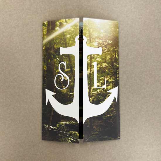
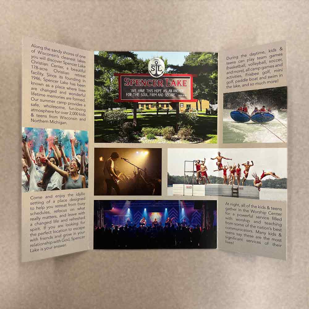
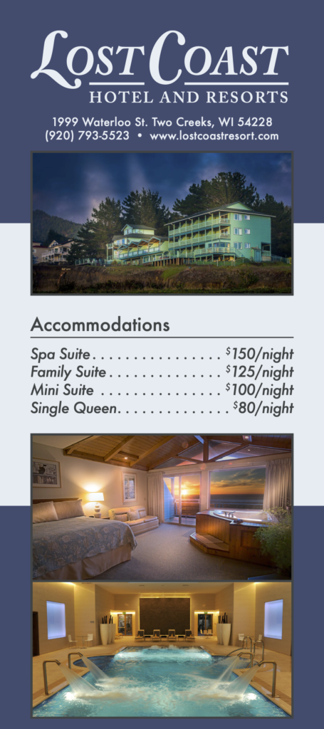
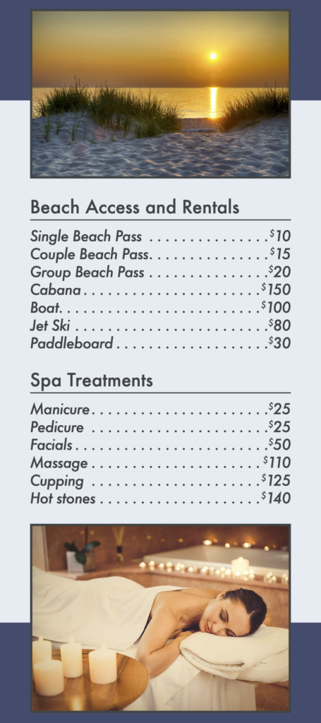
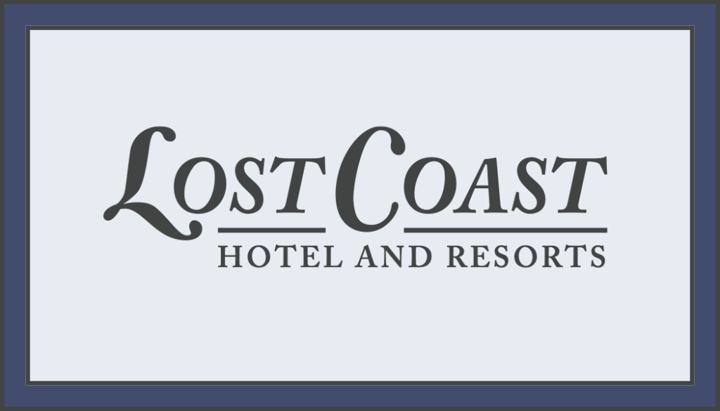
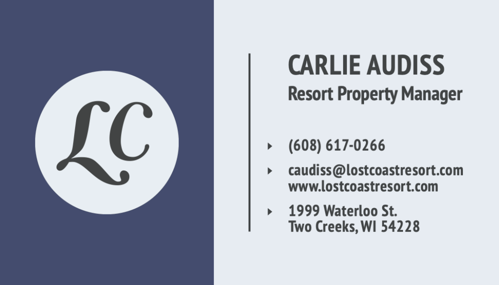
I envisioned Lost Coast as a beach/spa resort located in a secluded area, hence the name. When choosing colors for Lost Coast, I used different tints, tones, and shades of blue because I felt they had the strongest nautical appearance when used together. The materials for this project were created in InDesign using consistent layouts and styles throughout all four materials: a flyer, letterhead, rack card, and business card. Additionally, I designed the logos for the brand in Illustrator.